SCRIBD UX
–––UX WRITING + CONTENT DESIGNCOMPANY: Scribd
ROLE: Senior Copywriter
DATE: 2023
Partnering with Product Design, Customer Success, and User Research teams, I strategized and wrote UX copy to address a major user pain point — monthly reading limits.

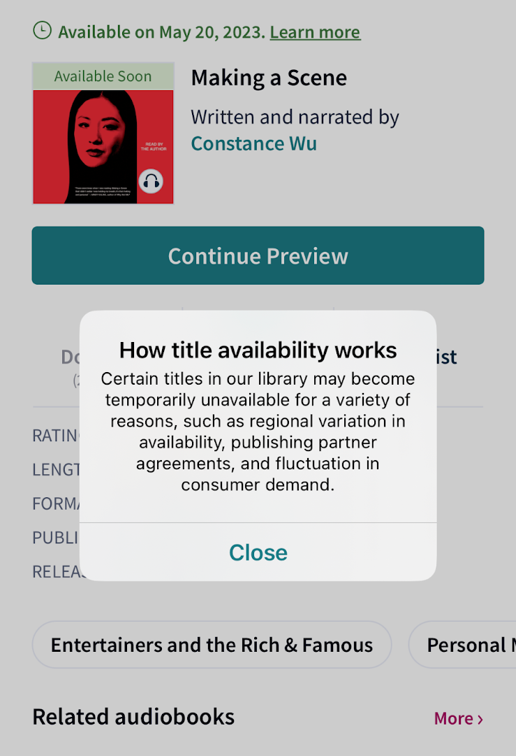
Scribd users were often frustrated when the title they wanted to read was suddenly unavailable. Previous messaging (see left) was vague, offered no recourse for the user, and did not make it clear when, or if, the title would be available again.
In reworking this copy, my goal was to address four key unmet user needs that our research identified:
Based on these findings, I wrote three variants for a new pop-up modal (below) that would appear once a user hits their monthly limit.
In reworking this copy, my goal was to address four key unmet user needs that our research identified:
- TRANSPARENCY: users want acknowledgement that a monthly limit exists
- CONTEXT: users want to know WHY the limit exists
- ALTERNATIVES: users want other content to enjoy in the meantime
- HELP: users want a contact point to receive additional clarity and/or help
Based on these findings, I wrote three variants for a new pop-up modal (below) that would appear once a user hits their monthly limit.

The tone of the messaging ranged from straightforward (left), to more playful (right), incorporating language around reading and stories in order to foster greater empathy with the user. To gauge users’ desire for context, the lefthand modal includes the line “Based on your recent activity” to indicate that limit is tied to the specific content they’ve consumed, and will reset when the their current billing cycle renews.
We then tested each variant, conducting interviews to measure users’ reactions to each messaging approach. Users indicated a strong preference for the middle option (“You’ve reached your limit”) due to its straightforward headline. However, some users said that the first line in the subcopy, “Every good story has an end,” felt a little too “sugarcoated,” and were frustrated that it seemed to be making light of their situation. Many indicated they preferred messaging that was clear, no-nonsense, and to-the-point. A majority of users also reported that the Help Center article (linked via the “Learn more” button) felt somewhat redudant and didn’t provide any additional clarity.

Utilizing these findings, I wrote a more concise, straightforward iteration of the modal (see left), omitting the Help Center link and keeping the qualifier “Based on your recent reading activity” to address users’ desire for additional context.
After implementing my copy, the CS team saw a significant decrease (23%) in tickets related to monthly limits, and user research reported an 8% increase in CSAT scores.
After completing this project and sharing our results with the wider org, my work informed company-wide best practices for future transparency messaging.
JULIAN FLEMING
©️2025
©️2025